
Eat From Home
Managing cooking while being at home
Problem Statement:
Managing a full-time job and daily cooking is a taxing challenge for busy professionals, leading to physical and mental fatigue.
Solutioning:
This innovative app redefines the cooking experience for busy lives. "Eat From Home" offers healthy meal plans, easy ingredient-based search without the typical hassles of meal planning, grocery shopping, and extensive kitchen cleanup for the busy user
Type:
End to End App Design


Background and Inspiration
I have had a couple of friends who live by themselves or with their spouses vent out to me time and again about how difficult it was for them to manage cooking every day, while having a full time job. I felt for them, realised how taxing it would be-both physically and mentally, having to decide what to make on a daily basis, stock up groceries, cut vegetables and stand long hours in front of the stove and oh let’s not even get started on the “washing the vessels” and “cleaning the kitchen” post cooking part.

UX Design Processes to the rescue
Once I identified the problem at hand, I wanted to incorporate the idea of Design Thinking — Empathise, Define, Ideate, Prototype and Test to come up with highly intuitive and useful design for an app for the problem stated above.


To access each of these phases directly, click on the spheres below:
🔬Empathise — Research, research until you get some insights
The first step was to understand if the problem I assumed was a problem was actually a problem. Hahaha, did that sound like a tongue twister?
That’s where the phase of Empathise comes in, where I had to do some digging and research to understand if this was indeed a problem that needed addressing and what are the other aspects and factors surrounding that problem.
So before I could do some digging, I had to zero down upon my research goal, after all without a goal I would not been clear about what exactly I needed to research on and this was the goal I came up with.
“To understand the current frustrations and pain points of managing cooking among working professionals so that we can work on building solutions to address the pain points.”
Once I identified the goals, I had to have some clear objectives on what are the things I had to focus my research on and narrowed down on the following:
How do people perceive cooking currently?
How does a working professional spend a day, balancing work and cooking?
How do they schedule and manage their cooking?
Understand the time and effort spent on meal planning and sourcing ingredients.
Understand the different ways by which they learn to cook currently.
👩🏽💻Secondary Research aka scouring the internet for insights :
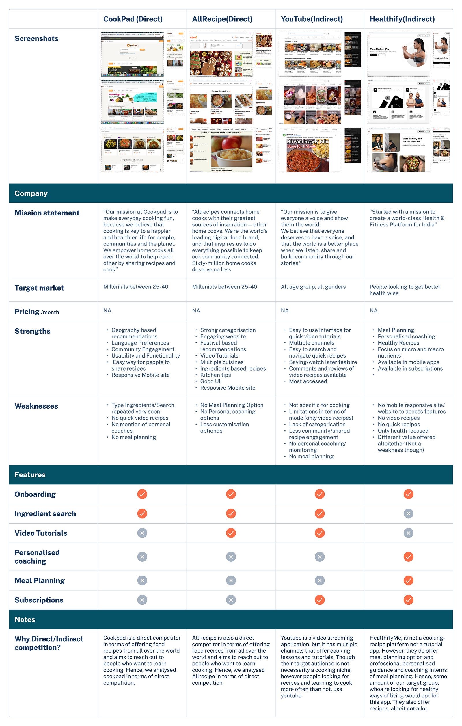
After outlying the objectives, I decided to work upon my secondary research to analyse existing apps and sites that have similar functionality or business model. It was a fun task browsing upon multitudes of sites and understanding their process. What they had to offer, what they lacked etc. I considered Cookpad, Allrecipe, Youtube and Healthify to understand their workflows in terms of how they would cater to the needs of busy working professional and here is my analysis.
🎙User Interviews aka fun-insightful-conversations :
This was the most joyous task because
There were so many insights that confirmed or validated my assumptions and
I got to talk to people with whom I hadn’t talked to, for a very long time.
Keeping in mind the research goals and objectives, I drew up a research plan that had some pretty interesting and thought-provoking questions and after narrowing down to 7–8 research participants (who were extremely involved and interested), I put on my “researcher cap” and conducted my interviews.
From the user-interviews I was able to come up with three kinds of personas, basically the people I interviewed could be broadly put under these three personas:


Classifying the people I interviewed into these 3 categories helped me understand who my target audience were, what they needed, what their goals and motivations were and if my assumptions were indeed true.
📝 Define — Identify and Address the problem head on:
Some of the insights I gathered from research are as follows:

I utilised the power of Point of View (POV) statements to uncover the needs and aspirations of the users. These concise summaries allowed me to empathise with their perspective and gain a deep understanding of their goals, pain points, and desired outcomes. By crafting POV statements, I effectively addressed the unique challenges faced by users and designed solutions that catered to their specific needs.
This user-centric approach enabled me to create impactful and meaningful experiences that drove positive outcomes and eventually the “How Might We” questions. Basically, we analyse the problem and try to narrow it down to How Might We solve the problem. I came up with a big list of all the possible How Might We questions, but these two questions stood out to me and I figured it definitely needed some addressing.

The transition from “How Might We” questions to the brainstorming phase marked a critical juncture in my problem-solving journey. With a clear understanding of the challenges at hand, I shifted my focus towards generating creative solutions. Armed with curiosity and an open mind, I engaged in a solo brainstorming session.
💡Ideate — On the problems to generate appropriate solutions
Brain Storming:
From so many of the ideas that I brainstormed, I felt two ideas to be most appropriate and also stayed in alignment with the problem I was trying to solve.

Story Boarding:
With the brainstormed solution, I went ahead and created what are known as storyboards. This was a very fun and unconventional, but an interesting project, where I visualised how the solutions I brainstormed were actually fitting to the user personas I created.


Once I had the storyboard, I had a clear picture of what features I thought was very important and would serve the purpose well for my target audience. As someone who liked sketching in general, this process really was fun and interesting, and the best part was , by the end of it I had a conviction on my solution.

Features Matrix :
The next step in the process was Feature Matrix — where I jotted down all the features I foresaw in my application and I had to prioritise them based on categories, viz. Must-Have, Nice-to-Have, Surprising-to-have and Can-come-later. I identified the following and this is how I categorised them:
Card Sorting:
Card sorting was conducted to understand how participants would organise features into various categories for a meal planning site.
Moderated hybrid card sorting was conducted with 4 participants for 39 cards and 8 categories. Most of the results from card sorting matched what I had in my mind.
100% of the participants agreed on 16 cards and 75% agreed on 8 cards.
• Save and UpdateMeal Plan
Site-Map :
Based on the results from card-sorting, I constructed site-map, which was the basic skeleton of what features and navigation the site/app would have.

User Flows and Task Flows :
User flows and task flows are essential components in the design process of a digital product. User flows outline the overall journey of a user through the product, illustrating the different paths they can take and the interactions they will encounter. Task flows, on the other hand, focus on the specific steps and interactions required to accomplish a particular task or goal within the product. In my case study, I utilised user flows to visualise the end-to-end user journey and task flows to demonstrate the step-by-step process for key tasks, ensuring a user-centered design approach.
Two user flows were designed for the two scenarios decided:
Quick Meals
Meal Planning
Task Flows were also identified and added
⚙️Prototype -To have a look and feel of how the app would be like
Branding :
Once I decided upon the features, user flows and task flows.. I wanted to work on the exciting part — colors, typography and logos. It was indeed an interesting process to zero down upon the logo, typography and colors that I wanted to use. I created a mood board first and then identified the branding and Logo.


Once I created the mood board, I could easily visualise the colors and images I want to work with. I also started sketching different logos and this is what I ideated and zeroed on.
After a lot of testing among peers and friends, I decided on the second logo. For typography, I found Proxima Nova and Noto sans to go well together and very pleasing to the eye for a reader. It worked out great. I also sat and iterated on various icon designs and finally narrowed upon 4 for navigation menu based on feedback and what worked well.
Hence I had the UI branding ready after many iterations and deliberations.
Now that the feel and look was decided upon, I had to start building my UI component library — buttons, icons, cards etc. that I would be using in mine. For this process, first I discovered some design patterns for inspiration and then went about working on my ideas to create my own UI component Library.

Prototyping :
The very next step is the design process was to put it all together in the form of wireframes. Initially I sketched my wireframes by hand, creating about 2–3 versions for each screen and once I had a proper feedback from my mentor on what would work, I had a better idea on what my final screens would look like. Then I went about digitalising my sketched wireframes for the screens that I found very appropriate.
After creating the sketches of wireframes, I sought feedback from stakeholders to further refine my design. Their insights and suggestions helped me narrow down to specific screens that best addressed user needs and goals. I carefully analyzed the feedback, considering usability, functionality, and overall user experience. By incorporating their input, I made informed decisions and refined the wireframes to create a more focused and intuitive product. This iterative process of gathering feedback and making adjustments ensured that the final screens aligned closely with user expectations, resulting in a more successful and user-friendly design.
After finalizing the digitalized wireframes based on feedback, I proceeded to create an interactive prototype. Using prototyping options in Figma, I transformed the static wireframes into a dynamic and clickable representation of the product. I added interactive elements such as buttons, menus, and transitions to simulate the user’s journey and demonstrate the product’s functionality. This interactive prototype served as a powerful tool for user testing, allowing stakeholders to experience the product in a realistic way and gather valuable insights. By iteratively refining the prototype based on user feedback, I ensured a seamless and intuitive user experience, paving the way for a successful final product.
Home page and quick meals section

Ingredient Search


Testing — Did we do fine?
Usability Testing:
Usability testing was conducted with 9 participants each of whom had given effective and useful feedback that really helped in improving the prototype further.
Key feedback were sorted it to “what worked, what needs to be changed, what questions and ideas need to be addressed” and were picked to work on
Some revisioning and……


Considering the concept of Banner Blindness and feedback from users , the Meal plan page was fixed to make it more intuitive for the user to click and so on

Based on the feedback from the usability test, some revisions were done and then we could come up with the final version of the app. The app had mainly two interesting features as we mentioned earlier:
i. Quick Meals
ii. Meal Planning
drumroll* The Final Version!!!

You can find the final prototype here
I got some really interesting feedback from people who were initially my research participants:
Some of the greatest feedback I had was :
“This looks great! You’re making me sad now that it doesn’t exist. I’m entirely serious-it looks like it’s incorporated all the things i wanted! I would 100% download and use this app”
-Anusha, a 35 something working professional
“Wish this was a real app, will be extremely useful. I really like all the features”
-Pavithraa, a 30 something scientist.
I was really glad at the output I received and working on this project gave a lot of satisfaction and joy, especially when I got feedback like stated above.
Key Learnings and Next Steps:
I am immensely grateful for the entire process of designing this app, from conducting thorough research to prototyping and testing. Each step along the way has been a valuable learning opportunity, allowing me to gain insights into user needs, preferences, and behaviours. The research phase provided a solid foundation for ideation and wireframing, enabling me to make informed design decisions. As I progressed to prototyping and testing, I gained firsthand experience in creating interactive and intuitive experiences that resonated with users. The iterative feedback loop refined my designs and strengthened my problem-solving skills. This holistic process has equipped me with a comprehensive understanding of user-centred design and has inspired me to continue crafting useful and user-intuitive designs in the future.